cargo, inc.
From in-car rideshare vending machine to cartop advertising — building a complete brand and product design system through two pivots.
I established the brand identity for the in-car commerce company and its international branches in Mexico and Brazil. Targeting drivers, riders, and brands simultaneously offered some interesting challenges — each audience required custom imagery, messaging, language, and tone of voice.
role
brand identity
product design
graphic design
web design
hub design
international expansion
technical documentation
Problem
When I joined, only the logo and a color existed. The business was scaling fast across multiple platforms, markets, and audiences simultaneously — with no visual system, no UX standards, and no documentation to support any of it.
phase 1: cargo
I built the complete brand system from the ground up — logomark variations, color system, typography, iconography, photography direction, and tone of voice. This included a library of 80+ custom icons with detailed hardware illustrations of the Cargo box itself.
On the product side, I designed the full B2C Cargo Store mobile flow across landing, store, cart, checkout, and confirmation — and the B2B Cargo App driver dashboard covering earnings, bonuses, profile, shipments, and referrals.
Beyond the product, I developed a social media template system with gradient rules coded by audience segment, and produced marketing materials including banners, posters, flyers, and driver recruitment collateral. When the business expanded into South America, I handled brand and product localization, and managed cross-team communications with the international teams in Mexico and Brazil.
The Outcome
The brand system that survived and evolved through multiple funding rounds, major brand partnerships, and an international expansion.

Text Hierarchy


Cargo Clear Space & Lockups

Cargo Business Cards & Flyers
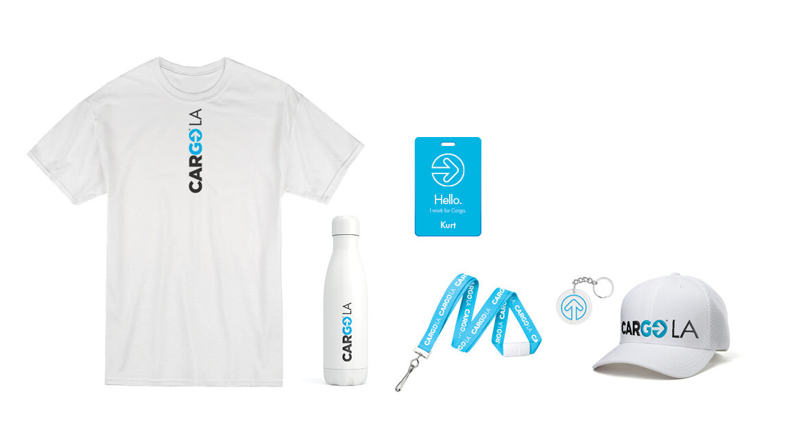
Branded Elements

Icons


Superday Logo

International Packaging

Billboard

LED Animated Banner Ad

Driver Appreciation Month Campaign Van

Driver Appreciation Month Campaign Event Space
Phase 2: Cargo Beam
When the business pivoted to cartop advertising — partnering directly with Uber — the entire brand needed to be rebuilt from scratch, all while the company headcount shrank to a skeleton crew.
I led the full rebrand to Cargo Beam, developing a new identity built for its hardware and driver portal. This included web design, messaging strategy, and physical hub design for installation centers. I also produced a technical manual with custom illustrations for hardware installers and a driver quickstart guide.
On the product side, I designed two digital experiences — an operations tech app to simplify and automate the internal installer onboarding process, and a driver portal that lived inside the Uber driver app. The driver portal was designed within Uber's existing color system while maintaining Cargo Beam's distinct brand identity. By simplifying the eligibility questionnaire, we were able to surface and capture the platform's top-performing drivers.
outcome
The Uber partnership launched successfully and the cartop advertising program went live across major rideshare markets.
big picture
This wasn't one project. It was two complete design systems built under pressure, through two pivots, serving four distinct audiences across consumer, enterprise, and physical touchpoints — all by one designer.


tech manual

illustrations

hub design


operations tech ux/ui


driver portal ux/ui
